


BIKiNNOV – Bike Value Innovation Center Association
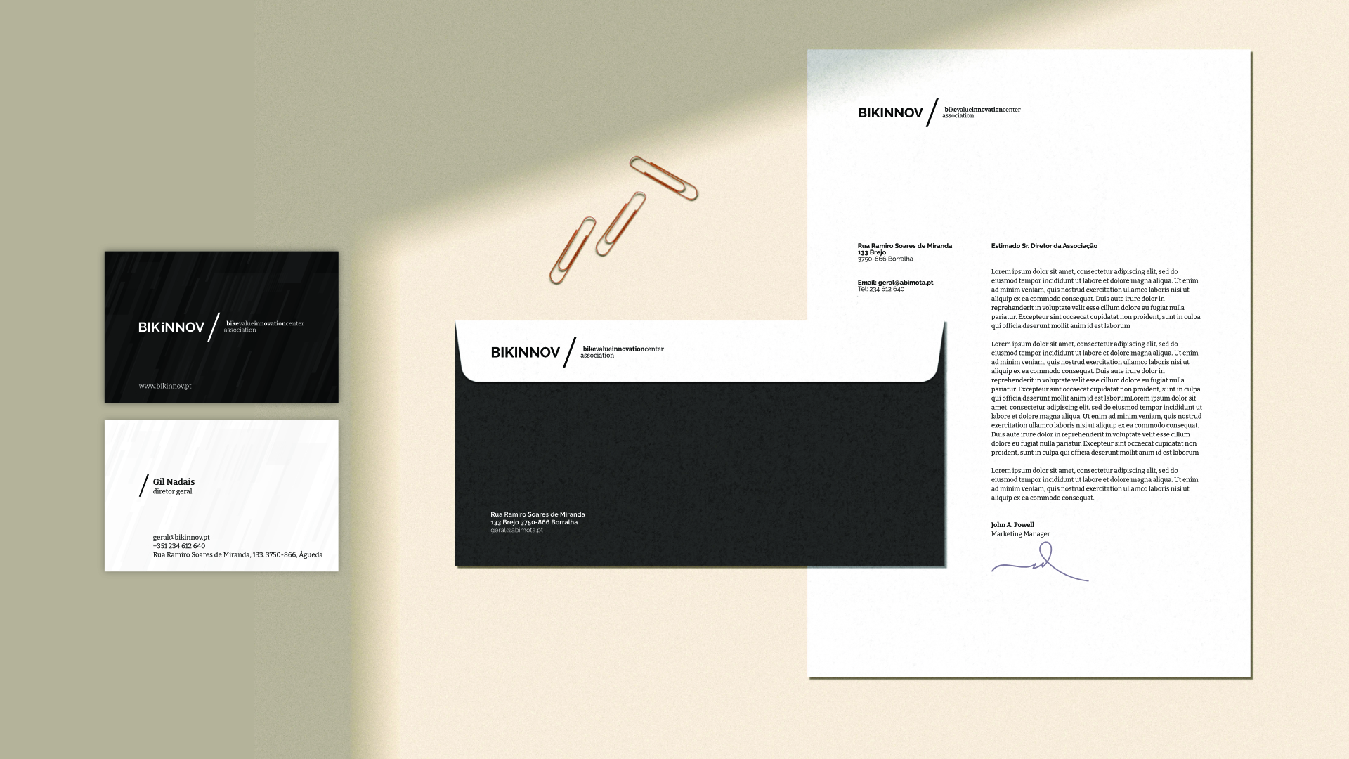
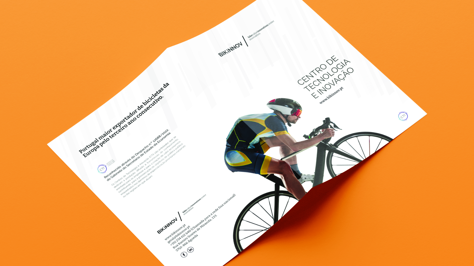
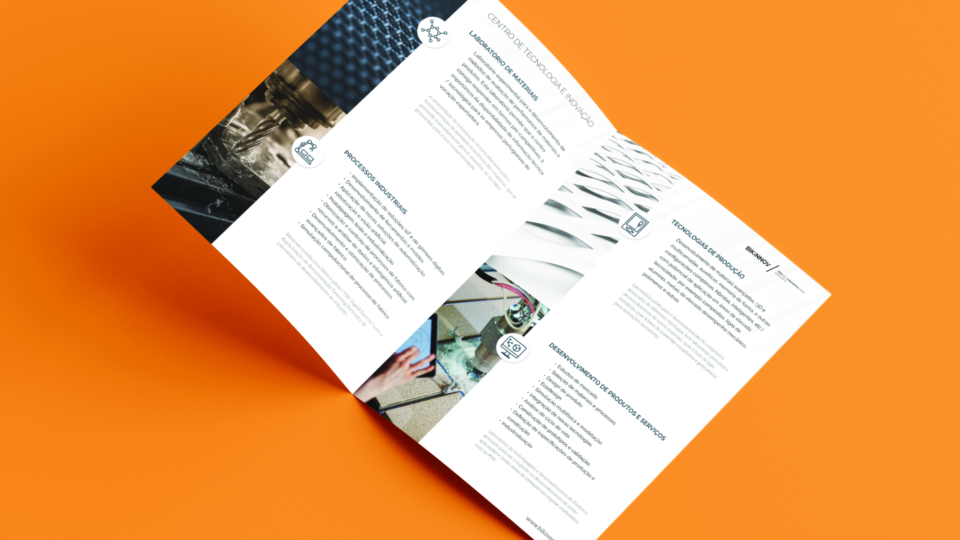
We developed the visual identity for the BIKINNOV brand, drawing on the concept of an interface – an element that connects two systems of a different nature.
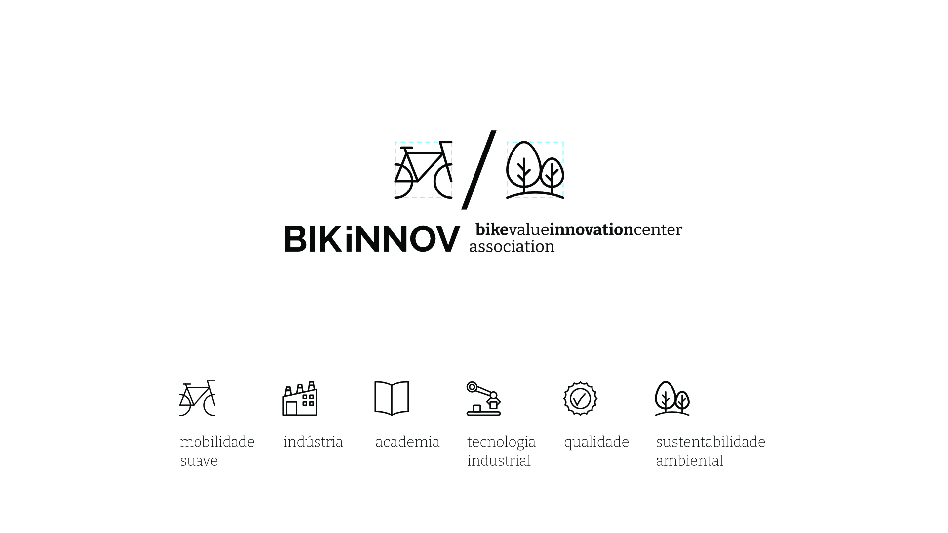
For noronhadesign, this Association can assert itself as a mediator between Science and Industry, Technology and Quality, Investment and Growth, Legislation and Validation. In other words, BIKINNOV can serve as the interface between Knowledge and Innovation in the soft mobility and two-wheel sectors.
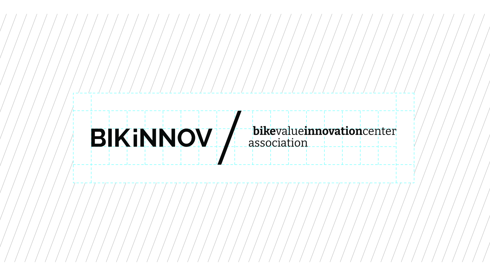
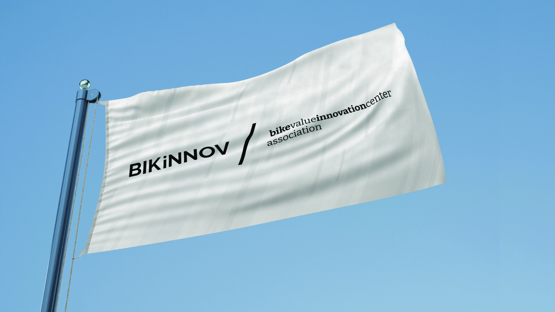
The proposed logo reflects this dynamic of intersecting fields. Based on the primary version — BIKINNOV / bike value innovation center – association — the brand can generate several sub-brands, reinforcing a scenario of collaboration, finished product, market engagement, consumer trends, promotion, resources, and more.
CLIENT
Abimota
WEBSITE
https://bikinnov.pt
YEAR
2022
FIELD
Branding / Communication Design / Graphic Design